Landingi Review: Is It Worth It?
I imagine that you’re going to love this Landingi review.
After all.
Not only will I be talking about some of the fantastic Landingi features?
But I’ll also be walking you through the process of creating a landing page.
Spoiler Alert: It’s pretty easy to do.
Let’s get right on into the good stuff.
Landingi Review: Video Introduction
Before we begin?
I also did a video about Landingi in case you’d rather see this review in action.
Feel free to click the play button down below to watch:
Landingi also comes with the ability to try them out for 100% free (no credit card needed).
I recommend that you sign up so that you can follow along with me:
Not onto the review walkthrough.
Landingi Landing Page Features And Templates Showcase

Given the fact that Landingi is all about landing pages?
It makes sense to walk you through the process of creating a new landing page.
As you can see from the image above, you have three options when getting started:
- Pick a template (I’ll be using this option).
- Upload a .landingpage file.
- Order a service.
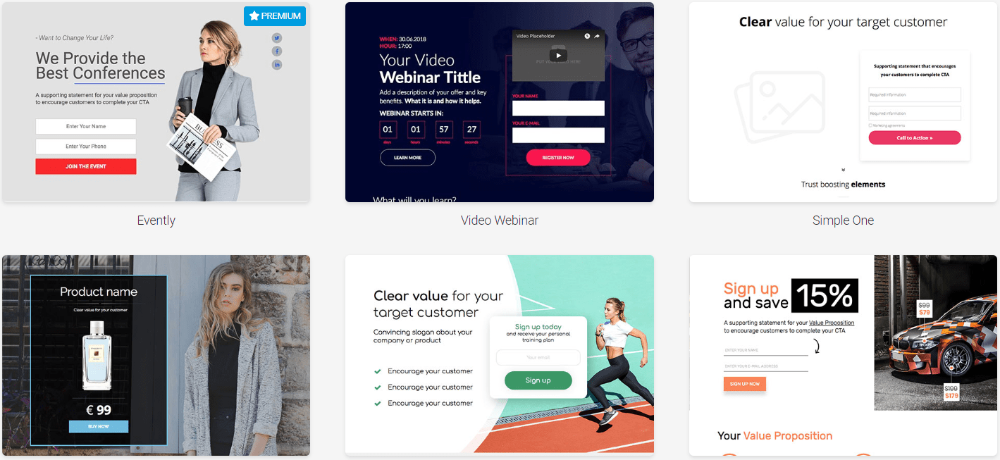
After clicking on Pick a template, you get taken to the buffet style of templates to choose from.
It’s safe to say that there’s a lot of them.
Note: I counted 236 total templates (which includes the premium ones).
The templates are also categorized to make it easier to find exactly what you’re looking for.
Here are a few examples of some business templates:

Elegant yet simple.
Not too shabby right?
Helpful Note: There’s even a section for Simple Templates which I like.
I happen to like the Simple Newsletter template so I’m going to use that one.
After selecting the template that you’d like to use, you arrive on their landing page editor:

Let’s take a look at what this drag and drop editor has to offer.
First, on the left side of the image above, you have your main actions like:
- Text.
- Videos.
- Images.
- Sections.
- Counters.
- Boxes and icons.
- Buttons and forms.
And you can even utilize HTML if your little heart desires (mine certainly doesn’t)!
What I like about setting up a landing page is that they utilize a true drag-and-drop editor.
So when you select a section on the left?
You can drag and drop it anywhere that you want on your landing page.
Cliff Notes: This is a good thing as it allows you more freedom and flexibility.
Here’s something unique that you usually don’t see with landing page editors:

You can edit your thank you page in the same editor without leaving.
Helpful Note: I outlined the tab in the red at the top of the picture above.
With other landing page builders you usually have to:
- Edit your main landing page and then back out.
- Edit your thank you page separately.
It’s all done in one editor when it comes to Landingi, which I thought was pretty helpful.
So overall, using their drag-and-drop editor is a pretty smooth experience.
You can always watch the review video I did at the top of the page to see it in action.
Or the more savvy alternative would be to test it for yourself:
Let’s take a look at another popular feature that comes along with Landingi.
Landingi Popups For Increased Conversions

You’ve been there before.
You’re about to leave a website or a landing page and a helpful popup grabs your attention.
People seem to have mixed feelings about these:
- They seem to love them.
- Or they seem to hate them.
Given the fact that I use them extensively, I highly recommend that you love them.
Not only are popups easy to use in general?
But they can significantly help you increase your clicks, leads, and even sales.
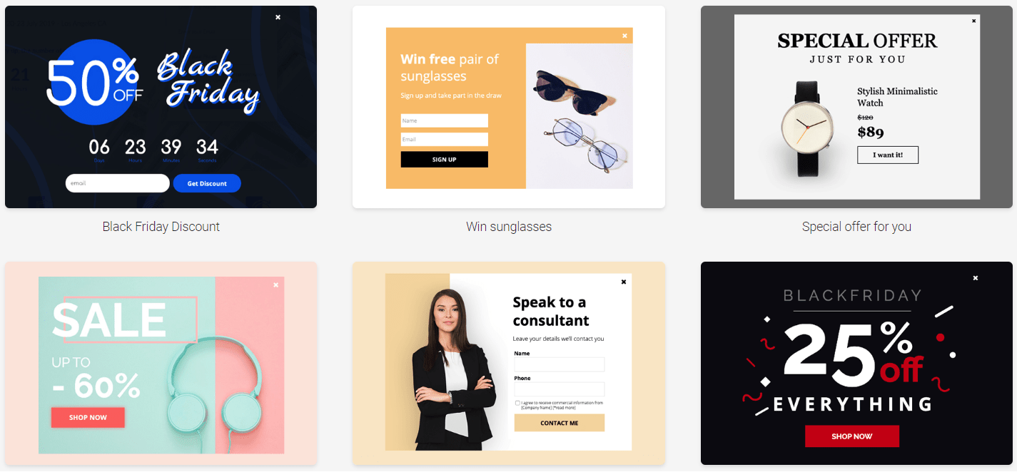
So when it comes to Landini, you can use popups for:
- Cross-selling products.
- Getting more subscribers.
- Offering some type of discount.
- Running a contest or a giveaway.
- Or simply having someone contact you.
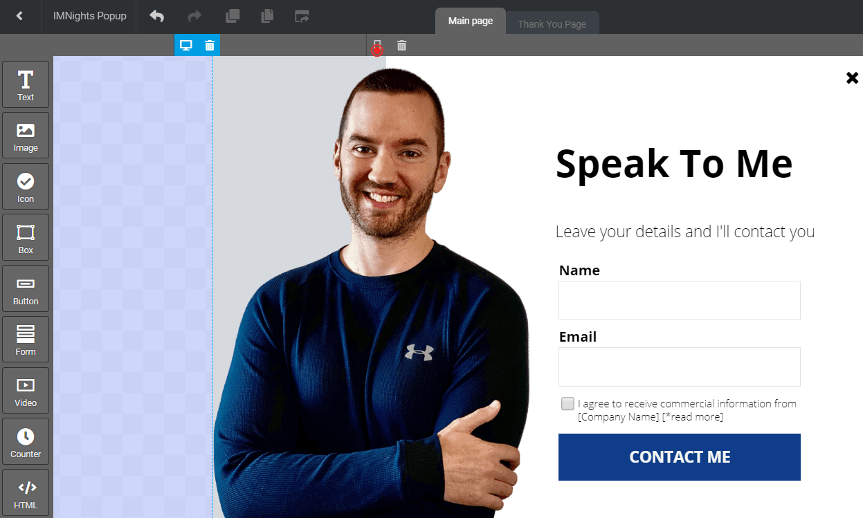
Down below is an example of a contact popup form:

It was a breeze creating a popup, given the fact that I used a template.
- I added in my picture.
- Then I changed around the colors and the headline.
After saving the popup, I went to the next section which offers a few different settings.
First, you can choose where you want your popup to show up:
- Landing pages (and/or).
- External pages.
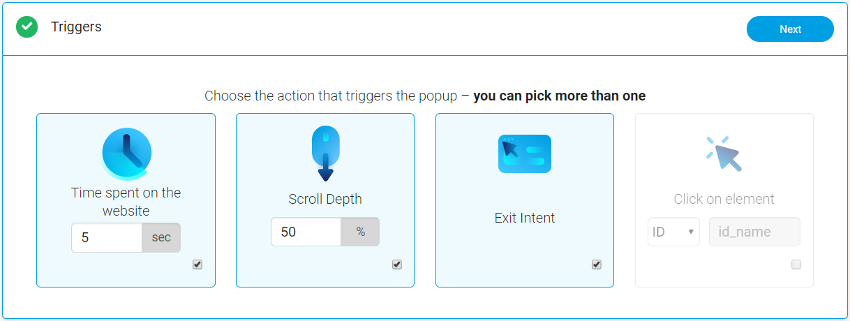
And then you get to choose your triggers, which is a very important part of popups:

As it says in the picture above: you can pick more than one (which is very helpful).
You have the option of choosing from:
- The amount of time spent on the website.
- Scroll depth which means the percentage of the page they scroll down.
- They have my favorite, exit intent, meaning that it fires when someone goes to leave.
Landingi also has a trigger for whenever someone clicks on a specific element.
Helpful Note: I like using the Exit Intent because it’s great for grabbing attention at the end.
You can also choose how often your popup will be shown to visitors.
Here is another image so that you can see all of the available options:

In case you’re on mobile and it’s harder to see the image above?
Here are some of the options when it comes to your popup frequencies:
- Show on every visit.
- Show only on the first visit.
- Always show after the X visit.
- Show only on the X visit (exactly).
How often you choose to show you popup is going to be completely up to you.
Nevertheless.
Show on every visit isn’t a big deal especially if it fires when visitors leave your page.
But that’s pretty much the last step of the creating process.
Landingi also gives you a code if you needed to add the popup to your website.
I’d recommend trying this feature:
Yup.
You save 15% if you go through the link above and decide to use this software.
I show you how it’s done in the related post below:
Highly Related: The details about the Landingi discount.
But speaking of prices?
Let’s take a look at how much the investment will be to use this landing page builder.
So How Much Is This Landing Page Builder?
The prices of Landingi are pretty simple, and here they are:
- Landingi Core plan is $39 per month.
- Landingi Create plan is $59 per month.
- Landingi Automation plan is $79 per month.
Here are a few important perks that come with their Core plan:
- Unlimited landing pages.
- 100,000 visitors every month.
- You also get 10 active popups (which increases to unlimited).
Also, keep in mind that the prices above are for paying once every month.
The price will drop if you end up paying annually (which is what most software tools do).
Plus: You also can save 15% just by going through my unique link.
If you’d like more details about that as well as more of their perks and prices?
I highly advise that you check out the post I did down below.
Highly Related: Landingi pricing.
So now you have a good idea of what to expect when it comes to Landingi.
Let’s move onto the end of this post now.
Landingi Review Conclusion: Is It Worth It?

Given the fact that Landingi isn’t as popular as many other landing page tools?
I was pleasantly surprised by their simplicity of creating quick landing pages.
So with that being said.
Let’s take a look at what I liked as well as what I didn’t like as much.
Landingi Pros
- Being able to create popups.
- Unlimited landing pages and a LOT of monthly visitors.
- Their simplicity is great as this is not a challenging tool to use.
- They have one of the best prices when it comes to landing pages.
And on the hand other?
Landingi Cons
- Premium templates don’t come with the Core plan (you need Premium or higher).
- You can’t utilize many big features unless you get their Automate plan.
A few examples of the big features that come along with the Automate plan include:
- Funnels.
- A B testing.
- Autoresponder.
- Advanced integrations.
Given the fact that the Automate plan is less than $79 per month?
This isn’t a big flaw considering all of the value that you get for your money.
So is Landingi worth it when it comes to creating landing pages?
Absolutely.
I was pleasantly surprised to see what this landing page had to offer.
Especially for the fact that I hadn’t known too much about them for a while now.
I highly recommend that you give them a shot:
Should you decide to turn that free trial into a paid plan?
By using my link above, you will also save an extra 15% from the prices above.
And that should do it.
Thank you for taking the time to stop by and read this Landingi review.
Have the best day ever!

